The Present Pro ribbons, along the top of the Present Pro workspace, provide options for running, formatting, and managing the appearance of your presentation. When you select different items on a slide, options are included on some ribbons that are relevant to the selected item, for example, you always see New on the presentation ribbon, but only see font formatting options if a text box is selected and the Component ribbon is selected.
- For more general information about the workspace, see Present Pro Workspace
Common options
Run presentation
Click Run Presentation (purple highlight, above) or press your F2 key to run the presentation. The runtime version of the presentation builds and opens in Present, with the slide that is currently open showing as the first page. Tip: Always save your presentation before you run it; this ensures you include your recent changes.
Ribbon selection
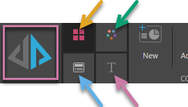
Due to the tremendous amount of flexibility provided by Present Pro, the ribbon is split into four. To access the required ribbon, simply click its corresponding tab as indicated in the preceding image:
- Presentation ribbon (orange arrow above).
- Design ribbon (green arrow).
- Slide ribbon (blue arrow).
- Component ribbon (purple arrow). The content of this ribbon, and its icon, depends on which item is selected on the canvas.
Presentation ribbon
The Presentation Ribbon offers quick access to a range of commonly-used tools. Some of these options also appear on the slide ribbon.

Tip: The ribbon is expanded by default. To free up canvas space, click the chevron (blue arrow above) to collapse it. With the ribbon collapsed, you'll need to hover over the minimized buttons to see the options. Click the chevron again to expand the ribbon.
|
Function |
Description |
|---|---|
|
Add a new slide to your presentation. Tip: You can also create a new slide from the add button at the top of the Slides panel. |
|
|
Build a new slicer and add it to your presentation using the New Slicer wizard. Note: Slicers added in this view can be configured with reference to their elements, type (dropdown list, buttons, and so on), behavior, and default settings. |
|
|
Unlink all sharable items and embed them as separate one-off instances in the presentation. For example, unlink shared visuals so changes to the original visual in, say, Discover or Publish no longer affect the copy in this presentation. |
|
|
Access copy, paste, cut, and delete functions. |
|
|
Hide the selected slicer. This option is only available where a slicer is selected on the canvas. |
|
|
Show or hide the panels that contain your visuals throughout the presentation. The panel is the frame or border that contains each visual. When you hide panels, the visuals or visual areas are still shown, but the borders, title, subtitle, and so on are hidden. |
|
|
Slide Canvas |
Change the color of the slide canvas using the Color Picker. This option only affects the canvas for the current slide. |
|
Configure the tile size used for the grid. This is only relevant when editing a presentation for the Mobile device type. |
|
|
Manage interactions between content items (slides, visuals, and so on) using the Interaction Manager. |
|
|
Show all interactions between all content items. |
|
|
Automatically add interactions when the relevant assets are added to the slides in this presentation. The default is for this option to be selected. |
|
|
Enable interactions between visual elements from different data models. |
|
|
Preview your presentation from the beginning. Tip: To preview the presentation with the current slide selected, click Run or F2. |
|
|
Select the functions that will be available at runtime from the Runtime Settings dialog. |
|
|
Configure a timer that controls how long Pyramid should wait before either opening the next slide in the presentation (when cycling between the different slides in the presentation) or refreshing the current slide. |
|
|
Reset Workspace |
If you move or minimize any of your workspace panels, you can click this button to reset the workspace back to its default layout. |
Design ribbon
The Design Ribbon allows the user to customize the design of their presentation. This includes tools that assist in placing assets on the canvas (like grid and guides), and options that affect the whole presentation appearance (like the design theme for the presentation).

|
Function |
Description |
|---|---|
|
Change the display size of the canvas when viewed in the app, relative to the available space. The options are: Fit to Page, Fit to Width, and Actual Size. |
|
|
Show or hide the ruler along the top and left-hand side of the canvas. |
|
|
Add guidelines to the canvas to help you with the layout of your presentation. |
|
|
Show or hide the background grid. This is only relevant to a presentation with a fixed layout. |
|
|
Enable or disable "snap to grid" for items added to the canvas. |
|
|
Select a preset canvas size from the dropdown list or select Custom to set a custom canvas size. |
|
|
Presentation Background |
Change the color of the presentation background (behind the slide) using the Color Picker. |
|
Select a preset style for the slicer. |
|
|
Choose a design theme for the presentation. Themes control the colors, fonts, masters, and so on associated with your presentation; ensuring a consistent and professional look and feel. |
|
|
You can undo formatting changes in bulk using Reset Formatting on the Design ribbon or the Reset to Default Styles option in the Formatting panel. These options restore formatting to the selected theme or, for options that aren't theme-based, revert them to the default. |
|
|
Recreate the thumbnail images used in the Content Manager. |
|
|
Create and add AI-generated images in response to a text prompt. Note: The size of the image can either be standard, or match the size of the canvas (for use as a background). |
|
|
Use a "highlighter text" effect to identify dynamic text while editing. |
|
|
Show an "empty" message when the dynamic text's underlying data point is empty. |
|
|
Automatically translate dynamic text using Pyramid's AI-driven Auto Translate feature. |
Slide ribbon
The Slide Ribbon offers a range of tools aimed at customizing the current slide. Some of these options also appear on the presentation ribbon.
|
Function |
Description |
|---|---|
|
New |
Add a new slide to your presentation. |
|
Build a new slicer and add it to your presentation using the New Slicer wizard. Note: Unlike in Present Lite, slicers added using this functionality are initially configured with reference to their elements, type (dropdown list, buttons, and so on), behavior, and default settings. |
|
|
Unlink all sharable items and embed them as separate one-off instances in the presentation. For example, unlink shared visuals so changes to the same visual in, say, Discover or Publish no longer affect the copy in this presentation. For more information, see One-off and sharable assets. |
|
|
Slide Canvas |
Change the color of the slide canvas using the Color Picker. This option only affects the canvas for the current slide. |
|
Show or hide the panels for all visuals on the current slide. The panel is the frame or border that contains your visual. Use the options on the dropdown list to change the panel settings for all the visuals on your Slide. Either select More Panel Options to edit the options in the Formatting Panel or select a preset Panel Style from the options on the list. |
|
|
Show or hide the titles for each panel on the current slide. |
|
|
Show or hide the subtitles for each panel on the current slide. Note: The subtitle is typically the breadcrumb trail, but can be replaced with a custom value. |
|
|
Automatically add interactions when the relevant assets are added to this slide. |
|
|
Remove all interactions from the current slide. |
|
|
Show the interactions on this slide. |
|
|
Manage interactions between content items (slides, visuals, and so on) using the Interaction Manager. |
|
|
Change the stacking order of the selected item, as layered on the canvas. (Send content items backwards and bring them forwards so that they are shown or hidden.) |
|
|
Align the object with the canvas or with another object on the canvas. |
|
|
Where three or more items are selected on the canvas, distribute those items vertically or horizontally relative to one another. |
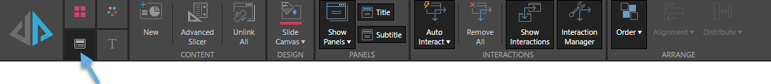
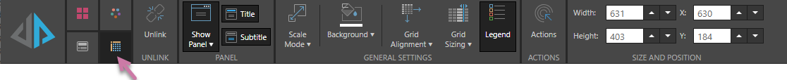
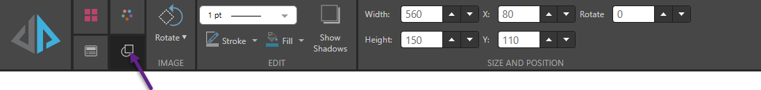
Component ribbon
The Component Ribbon offers settings and formatting choices that affect the look and feel of the currently selected item. As well as differing by selected item type, the options on the Component ribbon also differ depending on the visualization type of the selected visual.
Grid example
Text example

Shapes example
|
Function |
Relevant Item |
Description |
|---|---|---|
|
Visuals (All) |
Configure presentation actions. |
|
|
Background |
Visuals (All), Tabulate visual area, Slicer |
Change the background color of the selected visual or slicer using the Color Picker. |
|
Border thickness |
Shapes, Images |
Customize the Border thickness used by your shape, image, or illustration. |
|
Dynamic Text |
Access the copy, cut, and paste functions for the selected dynamic text. Note that these options apply to both the text itself and the underlying dynamic logic. |
|
|
Dynamic Text |
Dynamic Text |
Click to open the Dynamic Text wizard and configure dynamic text for the selected text box. Use the dropdown options to add dynamic text, dynamic placeholders, or text field variables to your selected text box. |
|
Fill color |
Shapes, Images |
Customize the Fill color used by your shape, image, or illustration. |
|
Text |
Change the text styling, including font type, size, color, emphasis, shadow, strike through, spacing, letter case, background color, text box border color, text box border width, and text background color. |
|
|
Text |
Toggles the selected text box between Graphic Text, which resizes automatically with the text field, and Standard text, which must be resized manually. Use the dropdown options to scale the Graphic Text automatically. For example, select 2 from the dropdown list to double the size of the text in the selected graphic text box. |
|
|
Grid Alignment |
Grid, Tabulate visual area |
Change the alignment of the grid within the visual. |
|
Grid |
Change the column width in a grid by selecting a preset, or by customization. |
|
|
Visuals (All) |
Show or hide the legend for the selected visual. |
|
|
Text |
Change the paragraph styling, including lists, indents, spacing, alignment, text direction, and columns. |
|
|
Scale Mode |
Visuals (All), Tabulate visual area |
Change the scale of the selected visual. |
|
Rotate |
Shapes, Images |
Rotate the item by 45, 90, 180, or 270 degrees. Also, Reset the rotation to zero. |
|
Visuals (All), Tabulate visual area |
Show or hide the panel that contains your selected visual. The panel is the frame or border around your visual. Use the options on the dropdown list to change the panel settings for your selected visual. Either select More Panel Options to edit the options in the Formatting Panel or select a preset Panel Style from the options on the list. |
|
|
Show Shadows |
Shapes |
Show or hide a Shadow beneath the shape. |
|
Size and Position |
Visuals (All), Tabulate visual area, Text, Shapes, Images |
Change the size and position of the selected item:
Tip: The X and Y coordinates and width and height are displayed underneath each content item when it is selected on the canvas. For shapes, text boxes, and images only, you can also Rotate the item by multiples of 10 degrees. |
|
Stroke color |
Shapes, Images |
Customize the Stroke color (the color of your shape's outline) used by your shape, image, or illustration. |
|
Styles |
Text |
Apply different heading styles. |
|
Visuals (All), Tabulate visual area |
Show or hide the subtitles for your selected visual. Note: The subtitle is typically the breadcrumb trail, but can be replaced with a custom value. |
|
|
Text Color |
Slicer |
Change the color of the text used to label the slicer. |
|
Visuals (All), Tabulate visual area |
Show or hide the titles for your selected visual. |
|
|
Visuals (All) |
Unlink the selected content item and embed it as a separate one-off instance in the presentation. For example, unlink a shared visual so changes to the same visual in, say, Discover or Publish no longer affect the copy in this presentation. |
|
|
Scrollable panel |
Select a background color for your scrollable panel. |